5.1 Why Is Data and Mathematics Beginning to Matter So Much in Biology All of a Sudden?
It is not as if mathematics in biology was not prevalent from the start; it has always been a core aspect of the subjectThe person, place, thing, or idea the clause is about; performs or experiences the verb.. However, as biological innovationThe process of creating new ideas, products, or methods. progresses it is now seen as a data science because biologists work with large amounts of information, like DNA sequences or data obtained from experiments. Modern technologies allow us to collect vast datasets, and maths and statistics are essential tools for making sense of this information. Picking biology to stay far away from maths, continuously avoiding chemistry and physics will not suffice anymore.
For example, when scientists study genes, they use statistics to figure out which genes might be linked to certain traits or diseases. In ecology, maths helps track how animal populations grow or shrink over time. These skills are important because they allow biologists to understand complex systems, make predictions, and develop new solutions. In today’s world, biology involves more than just lab work; it requires being able to analyse and interpret data accurately.
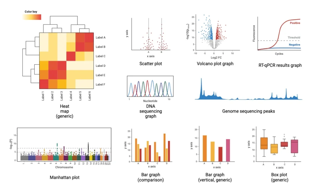
| Data Representation | Explanation |
| Heat Map | Uses colour gradients to represent data values, often illustrating gene expression or protein interactions. |
| Scatter Plot | Displays data points for two variables to reveal correlations or patterns in experiments. |
| Volcano Plot | Highlights significant changes in gene or protein expression, with points far from the centre indicating differences. |
| RT-qPCR Results Graph | Shows DNA amplification over cycles, essential for quantifying DNA in diagnostic and gene expression analysis. |
| DNA Sequencing Graph | Depicts nucleotideThe basic building block of DNA and RNA, consisting of a sugar, phosphate, and base (A, T, G, or C). base peaks, used for verifying DNA sequences and identifying genetic variations. |
| Genome Sequencing Peaks | Shows read frequency across genomes, helping detect gene duplications or deletions in genomic studies. |
| Manhattan Plot | Displays the statistical significance of genetic variants across chromosomes, often used in association studies. |
| ComparisonIdentifying similarities and/or differences between texts. Bar Graph | Compares values across categories, like treatment vs. control groups, commonly in experimental data. |
| Vertical Bar Graph | Similar to comparison bar graphs, used to display quantitative data across groups or samples. |
| Box Plot | Summarises data distribution with medians and outliers, useful for comparing variability across groups. |